
Here’s an update and upgrade to our mid-2011 post.
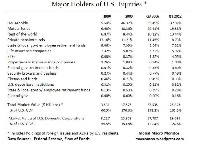
Lots of noise and imperfections in the Fed’s Flow of Funds data but sure beats the alternative – nothing. The biggest caveat, in our opinion, is the data include holdings of foreign equities by U.S. residents so not a concise measure on how the U.S. stock market is allocated. Also note the household sector is a residual calculation, which includes nonprofits, hedge funds and IRAs, among other noise.
The table below illustrates a large decline in the percentage of the equity market allocated to private pension funds. No doubt there’s noise here and it may also be partially explained by demographics but the decline over the past twenty years is glaring.
The data also show the growth of mutual funds and ETFs since 1990 as households have reduced holdings of individual stocks and increased their allocation to these sectors.

 (click here if chart and tables are not observable)


If I’m not mistaken, households also counts all non-profits – eg charitable foundations, schools (eg endowments), etc.? http://www.federalreserve.gov/apps/fof/TableDesc.aspx?t=L.100
Yes, that is right.
Pingback: Thursday links: tapped out theses - Abnormal Returns | Abnormal Returns
Pingback: The Tim Geithner Legacy Project | Felix Salmon
A reblogué ceci sur le blog a lupus…un regard hagard sur l'écocomics et ses finances…. and commented:
Add your thoughts here… (optional)